We have a kitchen!
After finally getting the bathroom renovated, our next task for the house wreck was planning the kitchen. Ours hadn't been touched since some time in the late 1950s, there was no oven, hob or extractor fan, and no matter how many times we cleaned it, it always looked exactly the same! For a germ-phobic person, this was quite distressing. This was what it looked like when we moved in:
We set up what we thought would be a temporary measure of a kitchen trolley and a mini oven/hob thing borrowed from a friend. It soon became apparent that we wouldn't be able to afford to renovate the kitchen any time soon, however, and the mini oven became the bane of our lives. If you put something in the oven or on the hob, it worked okay. It was when you tried to combine two functions that the little oven was all 'nope, I can do only one thing at a time.' We replaced the all in one contraption with a separate Stellar portable induction hob and a very fancy Panasonic NN-CF853 combination microwave oven (I owe eternal gratitude to the boy’s dad for helping us buy it!) which made everything so much more bearable. It's amazing what you can cook using the combination of these two gadgets - we had people over for dinner and everything! Although they did have to sit on wooden garden chairs, but you can't have everything...
Anyway, our lovely builders ripped out the old kitchen and grotty post-war downstairs loo. They left us a sink for as long as possible though, which was helpful. The first thing we fitted was the floor. Having been incarcerated upstairs for several days during the noisy, breaking stuff bit, Spangle was delighted to be allowed back in the kitchen and spent a gleeful 20 minutes chasing rogue tile spacers around the new floor.
We had originally wanted to go for an Ikea kitchen, as they had a lot of good reviews. Our builders, however, pulled many faces at me and promised to get me a massive Howdens discount if we didn't make them fit an Ikea kitchen. Apparently they are great for new build houses with lovely square walls, which our ancient Victorian terrace is very much lacking. The fact that Howdens also had the option of lovely big pan drawers persuaded me.
The boy finds all of the measuring/designing/planning/dealing with builders stuff very stressful and boring, and would rather be watching football or playing computer games, so I was pretty much winging it by myself! This is my attempt at kitchen planning tetris, 'assisted' by Loki:
And it's now all finished, yay! Three weeks of renovation actually wasn't that bad, as we'd lived with kind of a temporary kitchen for almost three years anyway. I just wheeled our trolley with the combi microwave and plug in induction hob into the living room, bought a mini barbecue, and also ordered a few takeaways.
I'm so pleased it turned out okay, as the boy and I have very different design tastes. I like colour and pattern, and had picked this fabulous Fornasetti Frutto Proibito monkey wallpaper before we'd even bought the house, whereas he likes minimalism and white walls.
The boy was very insistent upon plain white gloss units and he also wanted the Belfast sink. I wasn't sure whether a vintage style sink would work with modern units but it seems to have turned out okay.
I picked this Smeg Victoria retro styled built in oven and hob to try and balance out the vintage/modern clash. I really wanted this cranberry range cooker but apparently that was a step too ridiculous, even by my standards. Boooooo to the squashers of joy.
We decided on metro tiles, as I think they're kind of Victorian retro and classic modern at the same time, so fitted with the white gloss units, but also the more vintage elements. They are also cheap. I ordered so many tile samples to try and find the exact blue/green that matched the leaves on the wallpaper. It turns out duck egg blue comes in an extremely wide variety of colours!
Because the boy wanted a Belfast sink, our options for worktops were either solid stone/quartz (stupidly expensive) or solid hardwood. With the light porcelain floor tiles and the shiny white units, I was determined to add something dark and rustic, so went for solid wenge wood from Worktop Express. Their online sink and hob cut out service was utterly useless and pretty expensive, so we bought solid lengths and had our builders cut them to size. They may have called me many names for making them lift a 4 metre stretch of the stuff. Apparently the darker the wood is, the more dense and heavy it is, and this one was practically black in colour.
Apparently our house was originally plumbed by a maniac, so the pipes weren't able to be chased into the walls without taking the whole place apart. We had the option of boxing the pipes in and losing some space in our already small kitchen, or leaving them exposed and making a feature of them. Our plumber made such a good job of the new copper piping, I couldn't resist polishing them all up and lacquering them. Never leave a jeweller alone with bare metal - it's in our nature to make things shiny!
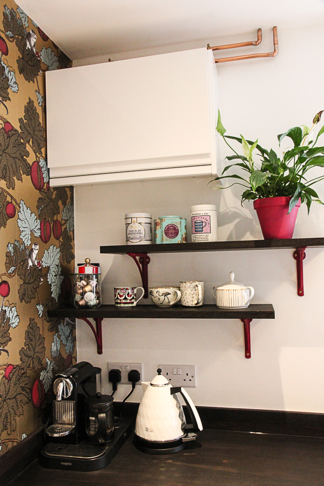
We had some offcuts of our solid wood worktops, which I wanted to make into some open shelves. The wenge was so solid it was like cutting through concrete, so our lovely local furniture maker cut and sanded the offcuts for me, and we attached them to cast iron brackets, which I spray painted to match the pomegranates on the wallpaper. I also painted some plant pots to match. There was a lot of eye rolling from the boy, but I think it looks great!
I added some final touches with this little Diamantini & Domeniconi mini cuckoo clock I bought years ago in the sale but never quite found a space for, and some fancy mugs, including this gorgeous one by Abi Overland Jersey.
The other part of the renovation was our tiny downstairs loo. Before we finished the upstairs bathroom, it was in fact our only loo, and was technically outdoors! I sadly don't have a before picture, probably because it was just too awful, but the guys did an amazing job of fitting a new loo and a hand basin in the tiniest of rooms. If you have a similarly tiny WC that needs renovating on a budget, I have done all of your research for you. This is the smallest loo you can get and this is definitely the smallest hand basin. You’re welcome. I added this tap and it all just about fits.
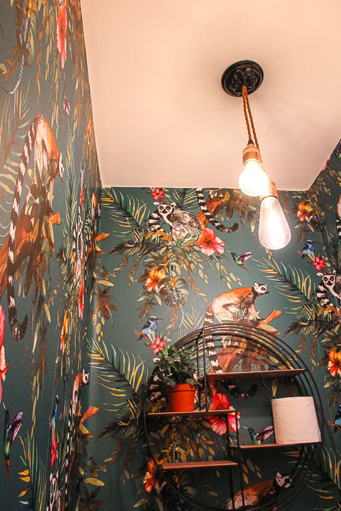
I think I read somewhere that there's no point in trying to pretend a tiny room isn't tiny by using pale colours, so I decided to go for a bold wallpaper. The decorator hated me. He said the pattern was a total arse to match, it took him hours and evil lemurs were staring at him the whole time! If you would like to create a similar evil lemur vibe in any room of your house, this is the wallpaper I used.
So, that's me done with our lovely wreck of a house for now. We need to save up a bit more cash for the next project, but I'm so happy the two major things are finished now. I am still filled with joy every time I enter the kitchen and the bathroom!


